Productivity Driving Prosperity: Decoding Local Economic Growth
People are the lifeblood of any economy – it is human labor that produces goods and services to be consumed. Yet some work creates more output than others, meaning that a country’s GDP is not merely equal to its working population. The other essential factor is productivity, or the amount of economic activity generated by each worker.
Productivity gains are achieved in many ways: A farmer switches to better fertilizer, a company streamlines workflows or a chef grows more skilled through experience. When workforces, industries and economies become more productive, they can provide more (and better) goods and services for the same amount of work. This progress helps to boost wealth and promote higher standards of living, which is why economists, business leaders and policymakers are all concerned with increasing productivity.
Productivity is an essential economic component and driver of growth, yet it can be challenging to measure. It is all around us yet invisible. To find signs of productivity, we must first know where to look.
Productivity’s Part in Growth
Analysts often compare the economic growth of countries, but it is less common to focus on the range of outcomes within a nation. As part of our American Growth Project initiative, we do precisely this for the U.S., examining the economic factors, indicators and outcomes that compose America’s diverse microeconomies. Synthesizing real-time economic and demographic data with figures dating back decades, we study 150 Extended Metropolitan Areas throughout the country to discern drivers of growth and why some areas excel while others fall behind. Our initial findings show a broad range of economic outcomes, commensurate with such a large and diverse nation.
We estimate, for instance, that the Austin EMA grew at a 6.1% annual rate in the 10 years ending with 2024, while Peoria, Illinois, shrank at a 1.6% annual rate in the same period. What are the reasons for this growth gap? Austin benefited from some of the nation’s strongest job and productivity growth, 2.4% and 3.5%, respectively. That is the best job growth we observed in our 150 EMA sample and the third-best productivity growth. Meanwhile, Peoria experienced the reverse – annual average job loss of 0.6% (the third-worst performance) and productivity dropping at a 1.0% rate (the second-worst outcome).
To put these numbers in perspective, the U.S. economy as whole grew at a 2.2% rate over the last 10 years, with employment expanding by 1.0% and productivity 1.1% on an annualized basis.1 As we discussed in The Power of Productivity, this period marks a very poor productivity performance, historically.
Hovering over an EMA in the map below allows you to view its 10-year GDP growth and rank, as well as its employment and productivity growth and their respective ranks. The toggles allow you to specify EMA size and regions with ranks changing to reflect the specifications. The tabs at the top allow you to view the one- and five-year growth rates and their job and efficiency breakdowns.
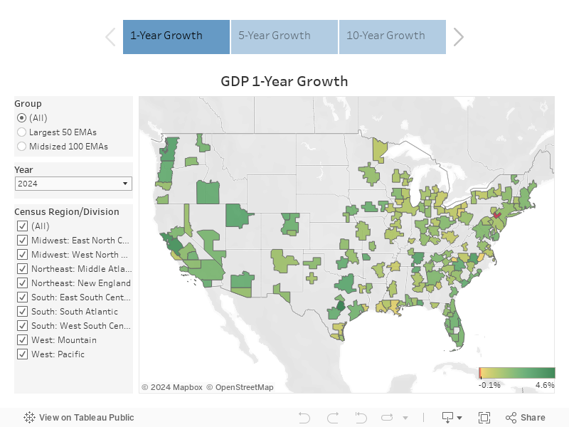
EMAs experiencing the fastest growth tend to outperform those exhibiting the slowest on both employment and productivity. For seven of the top 10 growers, job creation was the dominant factor driving their economic expansion, and, perhaps unsurprisingly, these cities are in the Sunbelt and Mountain states. The notable exceptions are the tech-dominated San Francisco Bay Area and Seattle, with San Francisco in particular experiencing supercharged productivity and meager job growth.
The gap between job and productivity growth is, on average, much larger for second-tier fast growers than for the top 10, meaning that these cities are more reliant on in-migration than efficiency gains. In some cases, such as Charlotte or Las Vegas, strong job creation is making up for subpar productivity advances. In fact, without the workforce growth, these cities would underperform Cincinnati or Washington, D.C. In an era of slow population growth at the national level, is migration-driven economic growth sustainable?
A Paradigm for Productivity
How can cities with low productivity growth improve this key metric? We can start by looking at a main driver of an EMA’s overall productivity: its industry mix.
The two most productive sectors in the U.S. are Finance and Real Estate followed by Information, meaning that these industries tend to leverage the greatest output from their workforce. Six percent of the U.S. workforce is engaged in Finance and Real Estate, and those workers create 21% of U.S. GDP. Two percent is employed in the Information sector, generating 5% of the country’s GDP.
You can use the dashboard below to view employment and output shares for every EMA’s major sectors – ranked by their national level productivity – and sort to see how EMAs as well as the U.S. (orange bars) perform. Dividing the GDP share by employment share gives the leverage ratio, an indicator of relative productivity. A higher leverage ratio indicates greater productivity.2
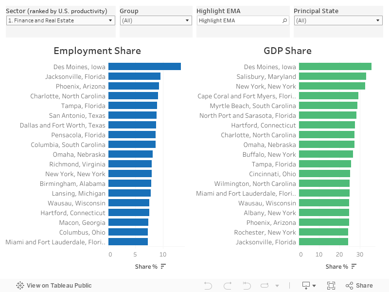
The interactive visualization yields many interesting insights. For one, a paradox in Charlotte’s economy emerges. North Carolina’s biggest city has one of the country’s largest employment shares (9%) in high-productivity Finance. Yet those workers produce “only” 27% of Charlotte’s GDP, a leverage ratio of 3, which is lower than the leverage ratio of 3½ for the U.S., 3¾ for Cincinnati and more than 4 for the New York EMA. These relationships are easiest to see in the dashboard by focusing on the largest 50 cities – check the “Largest 50” box under “Group” and use the search bar to highlight particular EMAs.
Over the last 15 years, Charlotte’s productivity growth in finance has been quite modest, and its share of output has been relatively stable. Meanwhile, the EMA’s Information sector has exhibited a growing employment share and strong productivity gains, yet the sector’s share of output and level of productivity remain below national averages. These data-backed insights provide a basis for asking key questions about a local economy, namely “why” questions. In this example, why is Charlotte getting less output from its high-output industries than are other cities?
By contrast, over the past decade, Austin has experienced rising shares in high-productivity sectors. Its Information sector today accounts for the fourth-largest employment share in the nation, and the EMA has exhibited solid gains in tech productivity, though both the industry share and the level of productivity remain substantially lower than Seattle’s and the Bay Area’s. These microeconomies have leverage ratios greater than 3, versus Austin with a leverage ratio of less than 2.
Austin’s data also highlights the importance of shifts in the industry mix away from more labor-intensive sectors, those exhibiting a leverage ratio less than 1, meaning the employment share is greater than the GDP share. Government and Leisure and Hospitality are two examples of labor-intensive sectors.
Austin has seen substantial growth over the last 10 years in the Business Services sector, whose subsectors show varying levels of productivity. But the companies driving that growth are moving their headquarters and research and development centers to the city.3 These facilities bring senior executive and R&D jobs, whose higher productivity lifts the sector’s leverage ratio.
Toggling to Business Services shows that Austin has the second-largest employment share of our 150 EMAs and a relatively high leverage ratio compared with other EMAs. If SpaceX’s recent announcement is any indication, these trends are likely to continue.
Skills and Standards of Living
Examining industry mix and relative sectoral productivity help us understand why certain EMAs are thriving while others are struggling. And yet, this type of investigation raises additional questions about why certain industries outperform others in general and in some EMAs in particular. We can find answers to these deeper questions by analyzing the capital available to workers, which drives productivity – i.e., robots, computers and software as well as a workforce’s skills used to employ that capital and create new innovations. The figure below is one illustration of skills harnessing capital and its effects on productivity. The graph plots EMAs according to the share of their workforce that has a bachelor’s degree or higher and works in the tech industry (on the x-axis) and its corresponding level of productivity (on the y-axis).4 There is a strong and significant relationship between the two variables: EMAs with a greater share of skilled workers in tech tend to be more productive.
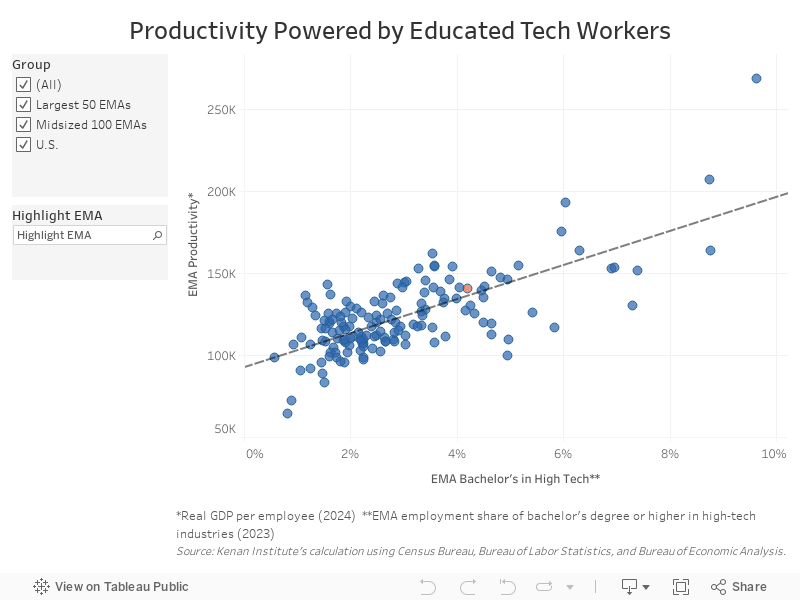
The visualization illustrates the wide variation in productivity across American cities, led by the San Francisco Bay Area at $269,000 of economic output produced per worker, almost double the U.S. average, while McAllen, Texas, has the lowest at about $64,000, half the national level of about $141,000, marked by the orange dot. (You can find a particular EMA using the Highlight EMA search bar). The chart’s dotted regression line indicates that a 1 percentage point increase in the share of high-skilled high-tech workers corresponds to a roughly $10,000 increase in an EMA’s productivity. This is an impressive relationship, yet it is important to note that many other factors, including industry mix, also contribute to EMA productivity.
The high-productivity cities in the graph’s upper-right quadrant generally enjoy greater returns for their efforts, which in turn allows them to sustain higher standards of living. To be clear: Labor productivity is not a singular determinant of societal health. Richer cities also tend to have higher costs of living, so residents of those microeconomies may not be as well off as the numbers suggest. And while higher productivity yields greater GDP, neither metric captures important issues like inequality, which has, by many measures, risen over the past 20 years between and within the EMAs we examine.
The Past as Prologue
Our data analysis shows how the combination of employment and productivity growth can lift an EMA’s fortunes. In 2014, Austin had lower output per employee ($119,000) than Peoria ($142,000). After a decade of productivity divergence, Austin now has the 15th-highest productivity in the nation ($151,000), greater than its Texas competitor Dallas and closing in on Houston. Meanwhile, Peoria, which had been in decline before the departure of Caterpillar’s headquarters in 2017, now exhibits productivity of $128,000, ranking 49out of 150 (notably, Caterpillar has landed in Dallas via Chicago).
The interactive chart below allows you to visualize the productivity performance of Austin and Peoria and all our EMAs over the past 10 years (middle column) and to examine the interplay between job and productivity growth, which has largely driven diverging economic outcomes.
This table helps to uncover some distinct challenges and opportunities. A major challenge is the divergence between the productivity haves and have-nots.
The table clearly shows this deviation as a national trend. In the 10 years ending 2024, U.S. productivity ranks 50th out of 150, meaning that in this period two-thirds of our EMAs experienced weaker productivity growth than the national average. Opportunities may be found in some surprising names in the list of top productivity performers, including Portland, Maine; South Bend, Indiana; and Kalamazoo, Michigan. What are these midsize EMAs doing that’s boosting their productivity in a period when larger cities seem to have the advantage?
With this type of analysis, accompanying data sets, and the toolkits built out from our research, we aim for the American Growth Project to help business and policy decision-makers create equitable growth across the nation.
1 Employment and productivity growth rates may not add up to the exact GDP growth rate because of definitional reasons and rounding.
2 These ratios are a good but imperfect approximation of relative productivity, as the overall level an EMAs productivity plays a role.
3 For more information on sector makeup see the following https://empoweringamericancities.com/wp-content/uploads/2024/02/Supersectors_subsectors-names-descriptions.pdf.
4 For a more in depth explanation of why the technology sector and San Francisco has such high productivity see The Power of Productivity.